While working with The National Group my key responsibility was to create a professional, cross platform image for the business. As one of the only FSC certified printers in the Greater Lafayette Indiana area, The National Group was a hidden gem to many designers and marketing departments. Offering top of the line print products and same day service on many products, I can testify they give peace of mind to deadline ridden designers!
The National Group is Forest Stewardship Council TM (FSC®) Certified by the Rainforest Alliance. The FSC logo identifies products that promote environmentally appropriate, socially beneficial, and economically viable management of the world’s forests.
As a past print client and now consultant I wanted to make the new brand image consistent with not only their offerings but they strong values and mission. The key to this consultation was working directly with the staff to develop a consistent brand that staff could then implement and maintain once I was gone.
The Branding Manual
 We started with a week in evaluation of the current brand image. What was the public seeing and what was The National Group staff saying? Were they the same message? Although The National Group is small with just under thirty employees, their internal understanding of the business was unclear. We conducted an in house employee survey which resulted in response from many long standing employees.
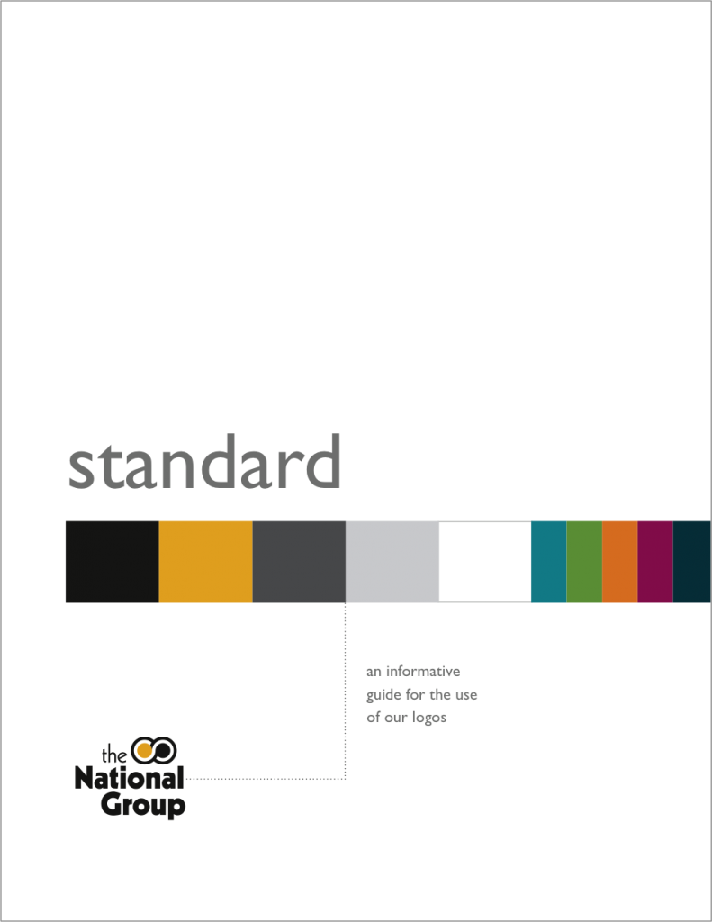
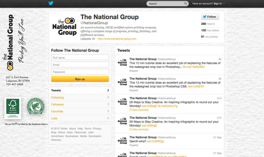
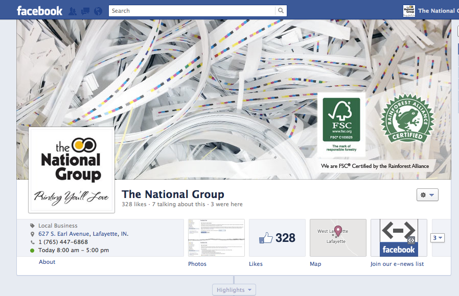
Between the website and social media the brand was also being used inconsistently on apparel and other publicly visible areas. The branding standard guide was created to share information with staff and also outside vendors on the overall look and feel of the company’s identity standards. In conjunction with their employee hand guide, this booklet was created to share the branding standards so that each project is executed with the highest level of craft.
The brand Standard book that contains Logo Standards, Color Options, Acceptable Taglines, Fonts, textures that go with the brand, logo use on embroidered items, etc. The Standard book was primarily an internal guide for employees. A one page guide with logo usage was created for outside venders such as apparel embroidery.
Website and Mobile Site

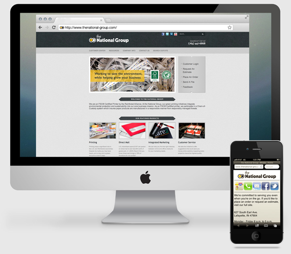
Next we evaluated the current website and the analytics of each page. Looking at click through rates and page hits we were able to establish top content and remove or relocate content that was getting lost. We evaluated the last 90, 60, and 14 days to compare numbers and page visits over time.
Something that was also missing were direct links to the social media pages on the home page and mobile site. This is something simple to add and is a key in creating a consistent cross-platform brand.
The mobile site was really created as a landing page for print clients to access emails and contact information for their print sales representative. In addition they could access hours, location, and social media news.
Social Media Branding


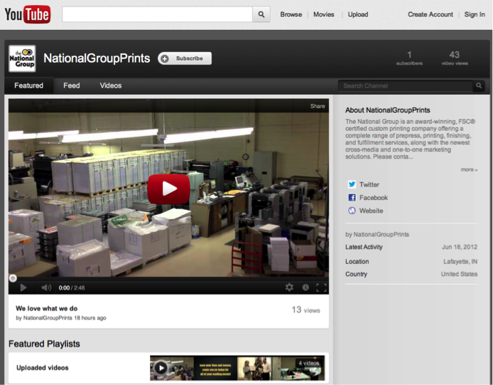
YouTube Page
In addition to Facebook and Twitter we updated the YouTube page. With no videography equipment and no budget the video was shot with an iPhone and edited in iMovie.
